A Women’s Work is a web catalogue of the women artists in the Cleveland Museum of Art’s open collection, built to reframe the historical dismissal of women’s artistic labor. Of about 5,000 works the museum records as made by women, only 271 can be shown with an image, so the site pictures those and lists every other work by name, so that no woman who made one goes uncounted.
A Women’s Work
Class Project: Open API website, Fall 2026
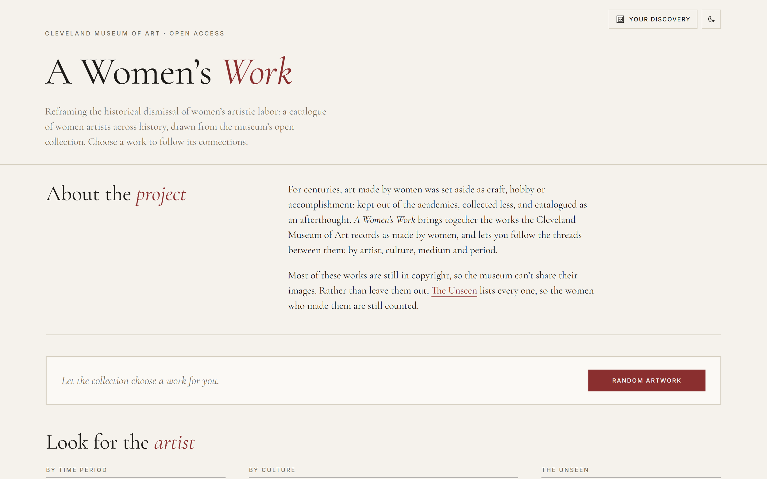
Explore the website here (Live Site): https://a-womans-work-project.netlify.app
Many people know the phrase “there were no female Renaissance artists.” With a background in art history, I knew it wasn’t true. Artists like Sofonisba Anguissola and Lavinia Fontana were celebrated in their own time, but their voices were drowned out by the histories written after them, and women artists are still overlooked today.
The brief was open: pick a subject I enjoy, find an open API about it, and build anything I wanted. I knew I had to make something special: a way to put women artists back at the center of the story, using a real museum’s own collection as the evidence
Why this project
Role
Concept, research, UX and visual design, front-end development
Timeline
Nov 2026
Data
Built with
HTML, CSS and JavaScript (no framework), built with the help of an AI coding assistant
The challenge
The museum’s data repeated the very erasure I wanted to challenge. Its records list no works by women dated before 1600, and of about 5,000 works by women, only 271 can be shown with an image.
The museum shares images only of public-domain works, and most art by women in the collection was made in the last hundred years, so it is still in copyright. A conventional image gallery would have shown roughly 5% of these artists and quietly left out the rest.
The question became: how do you build a gallery when most of the art can’t be seen?
Three practical problems sat underneath it:
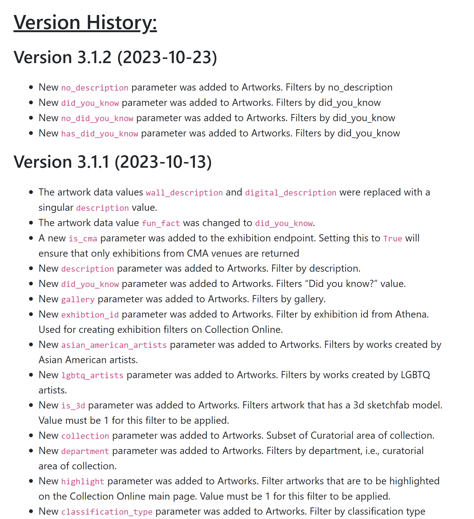
The API wasn’t built for this question. It can’t ask for works without images, so finding them meant reading all 5,000 records, which took 13–26 seconds on the museum’s server.
The data is messy. Culture labels mix places and periods (“France, 20th century”), and on co-created works the first credited maker isn’t always the woman.
Most of these names are unfamiliar. A search box alone doesn’t help visitors who don’t already know who to look for.
Process
Tested the API before designing anything. I checked each assumption against the live data: which filters exist, how dates behave, what a record looks like. This is where the 271-of-5,000 gap and the empty pre-1600 record first showed up.
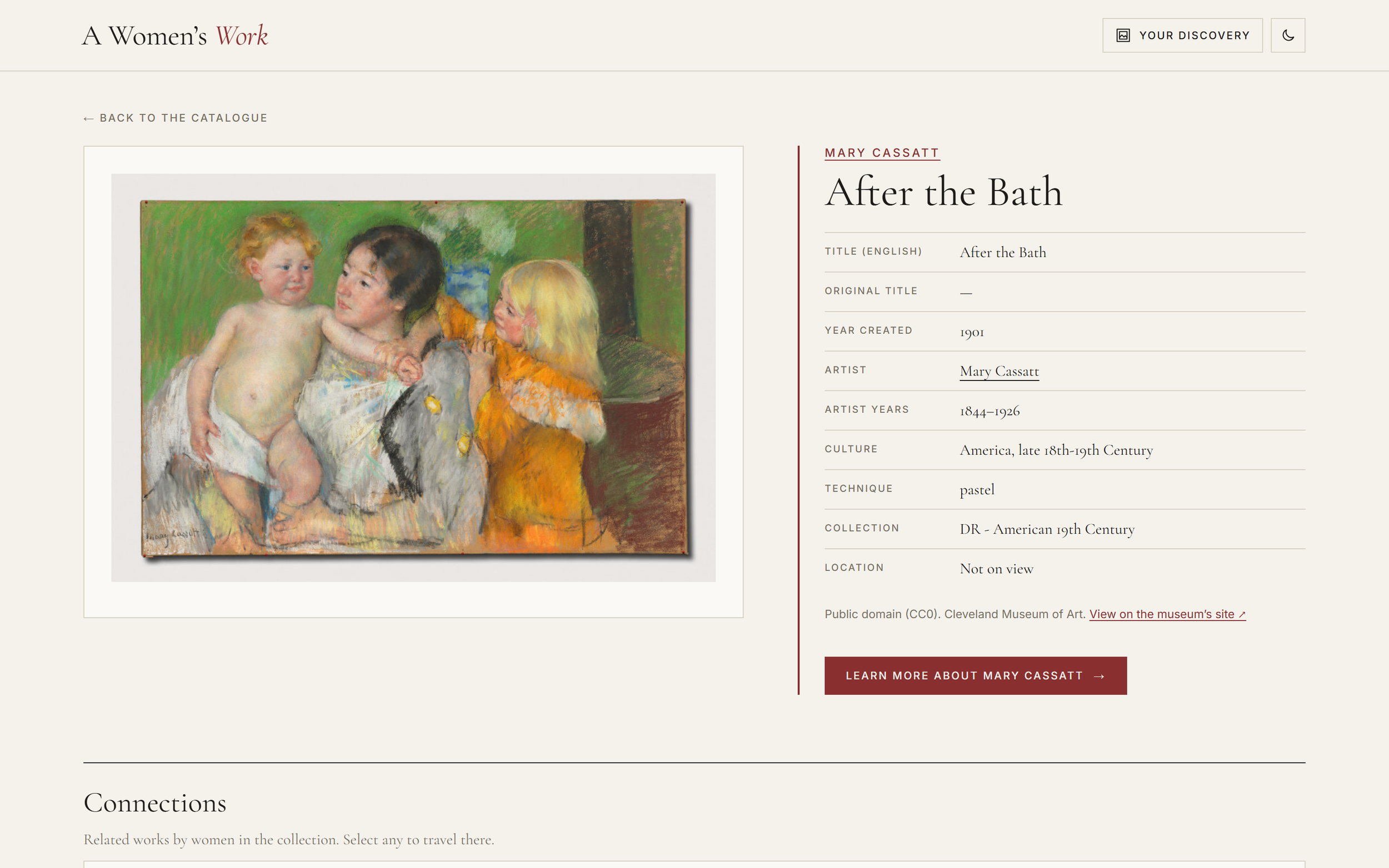
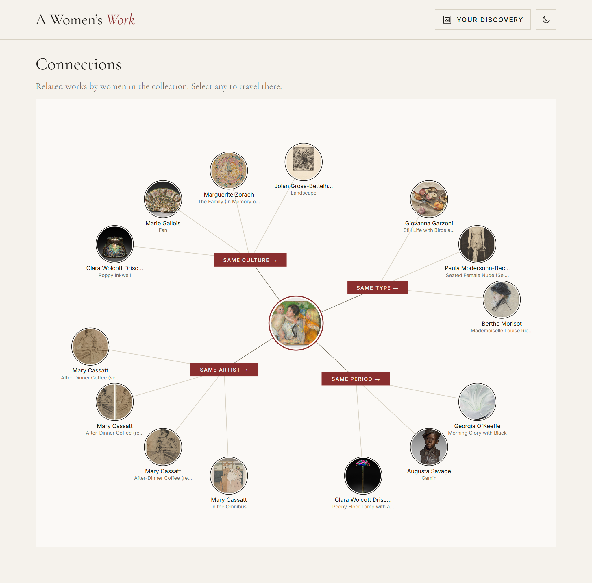
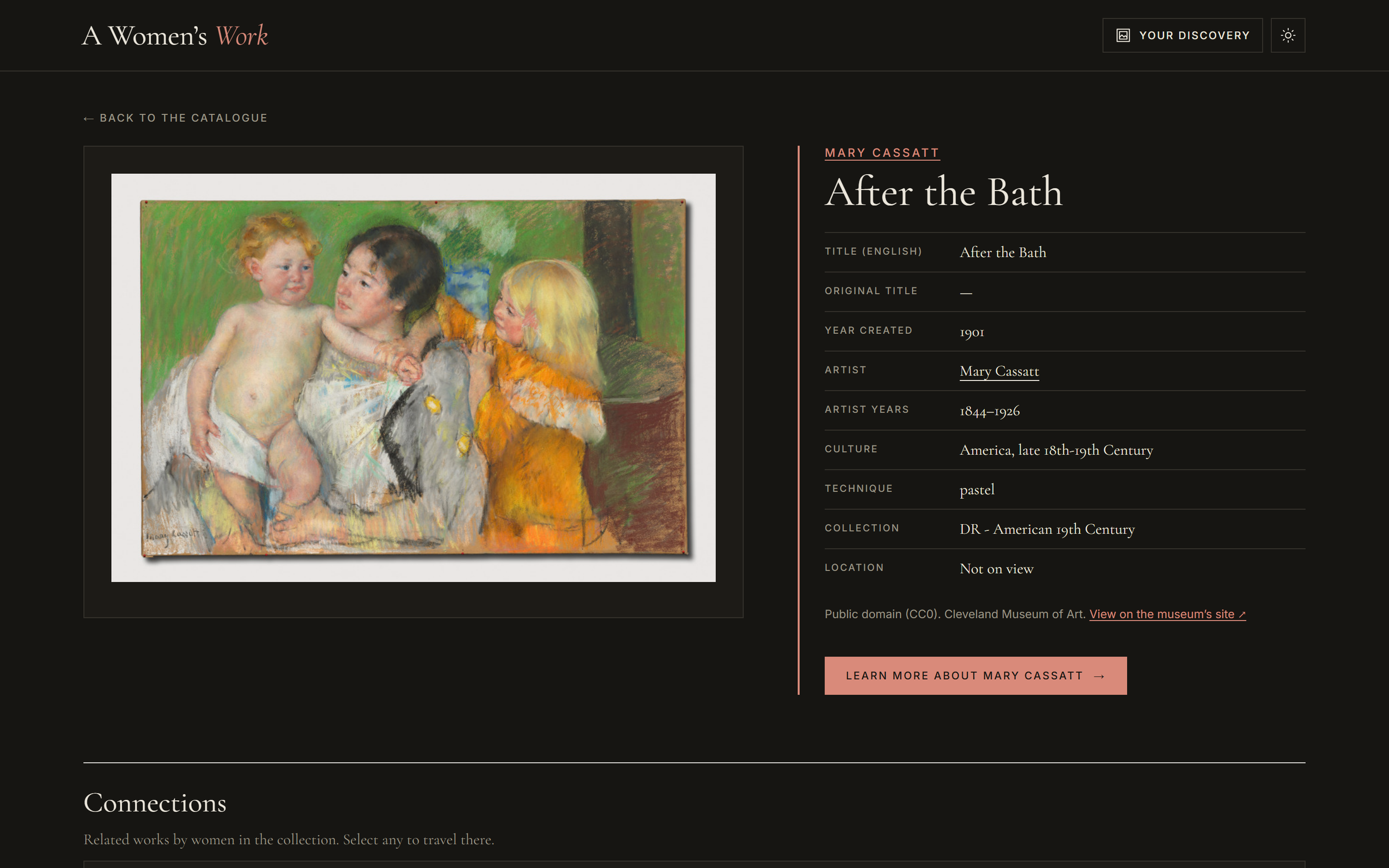
Built a working prototype. A catalogue grid, an artwork page styled as a museum wall label, and a map of related works.
Made the data usable. I trimmed culture labels to the place name, switched the connections to the API’s structured filters, and removed two early time periods that held no works by women.
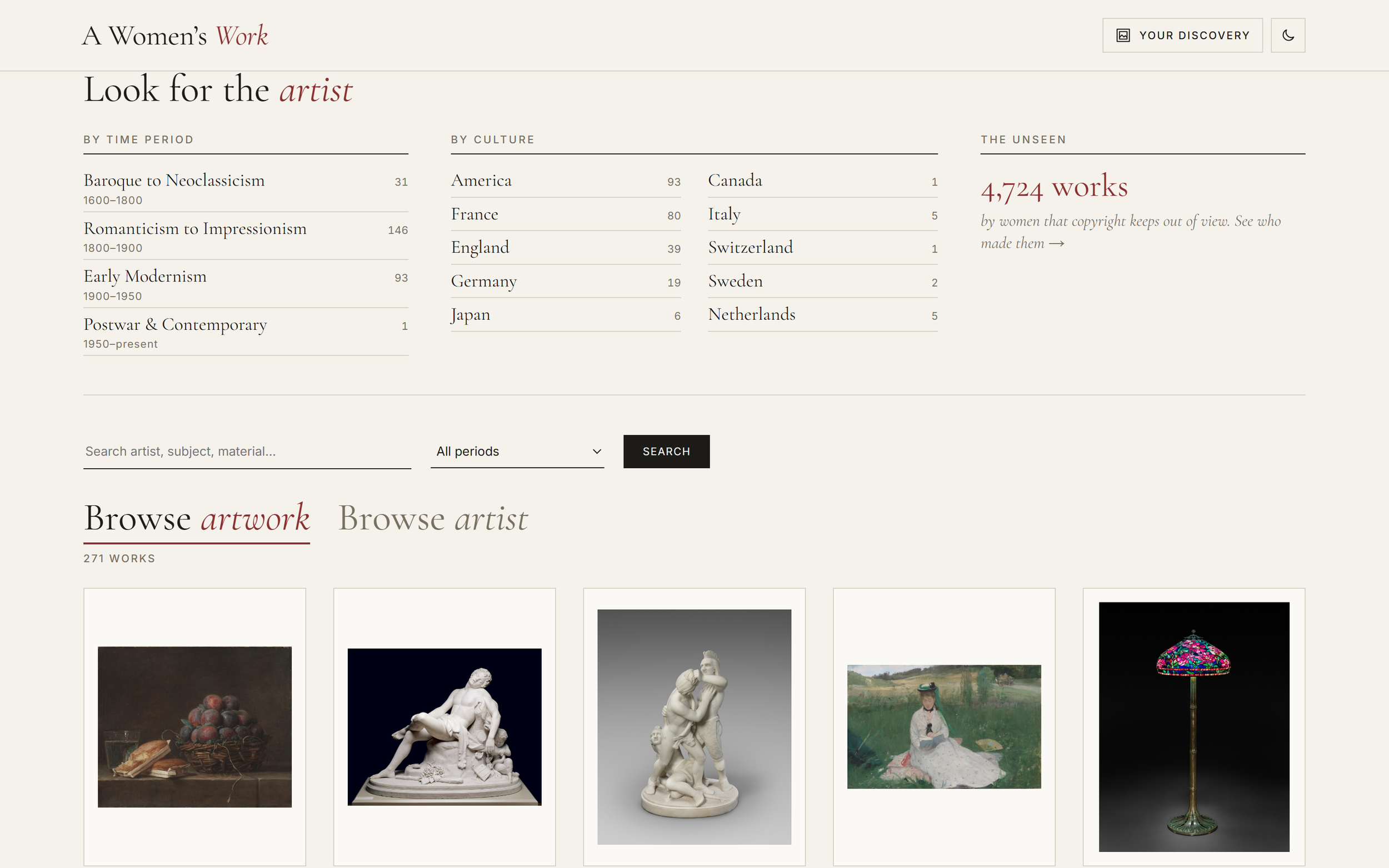
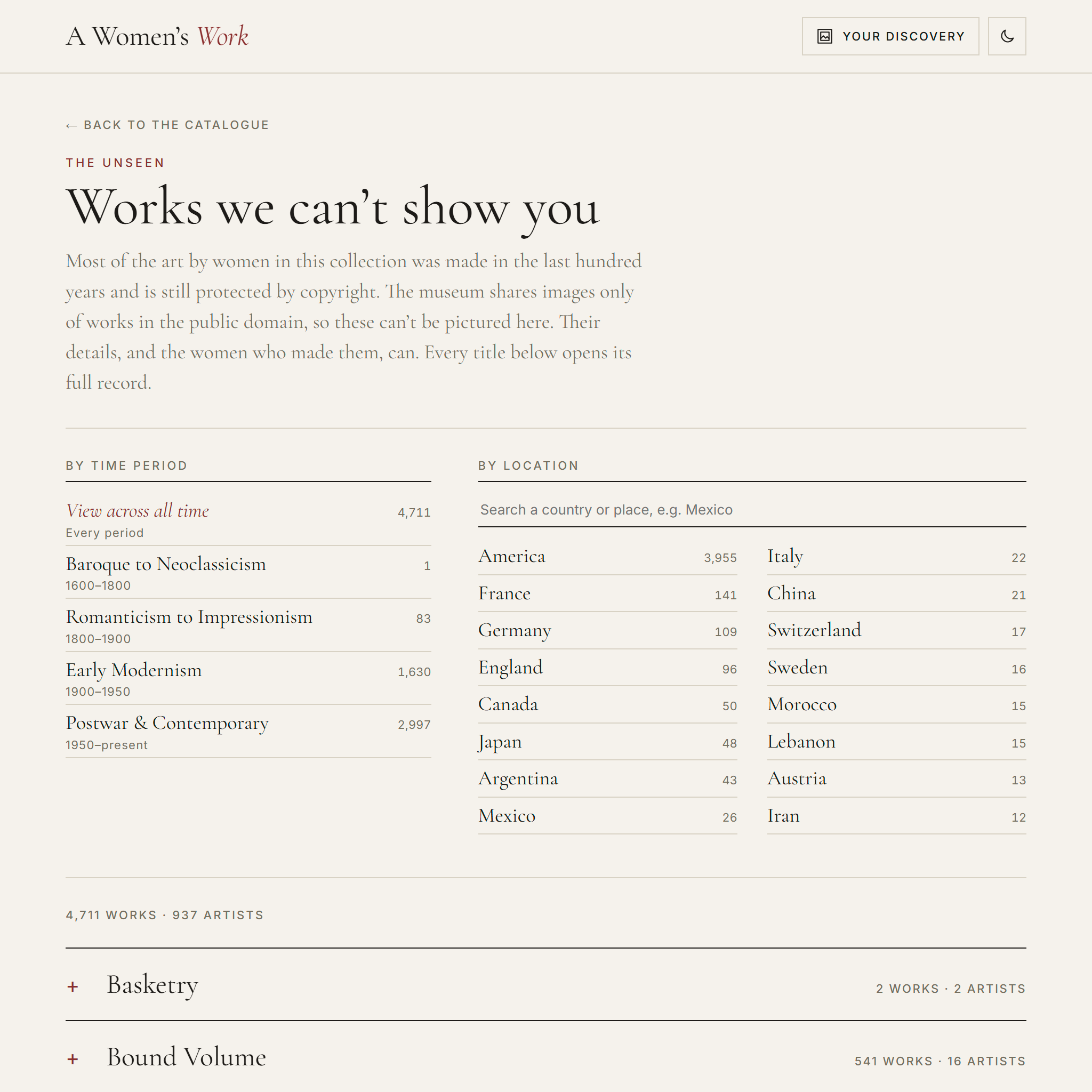
Turned the gap into a feature. The works without images became their own page, The Unseen, instead of placeholders scattered through the grid.
Added ways in for different visitors: named time periods, culture menus, a random artwork, search that explains its matches, and a switch between browsing works and browsing artists.
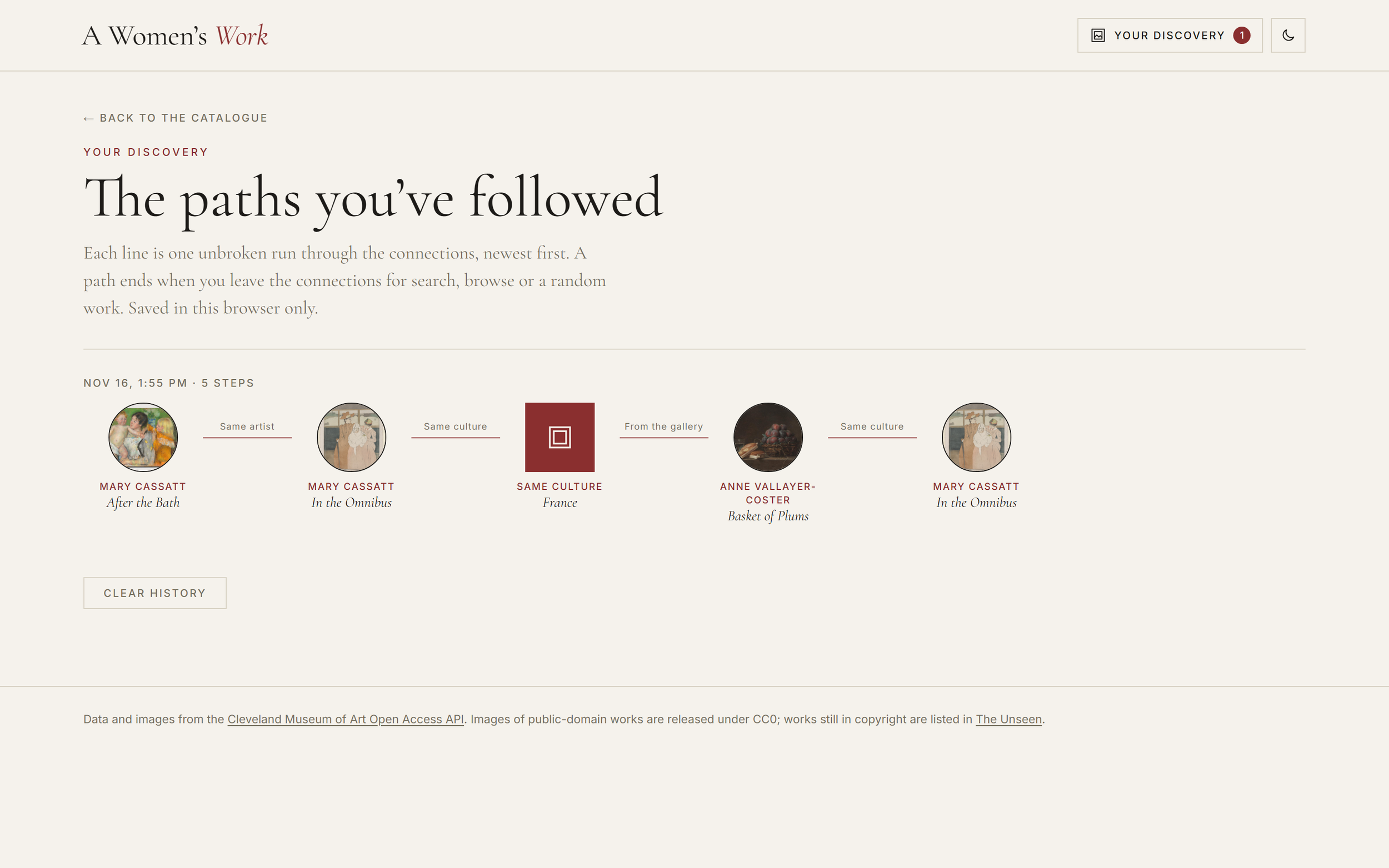
Made exploration personal without accounts. Your discovery records each path a visitor follows, stored only in their own browser.
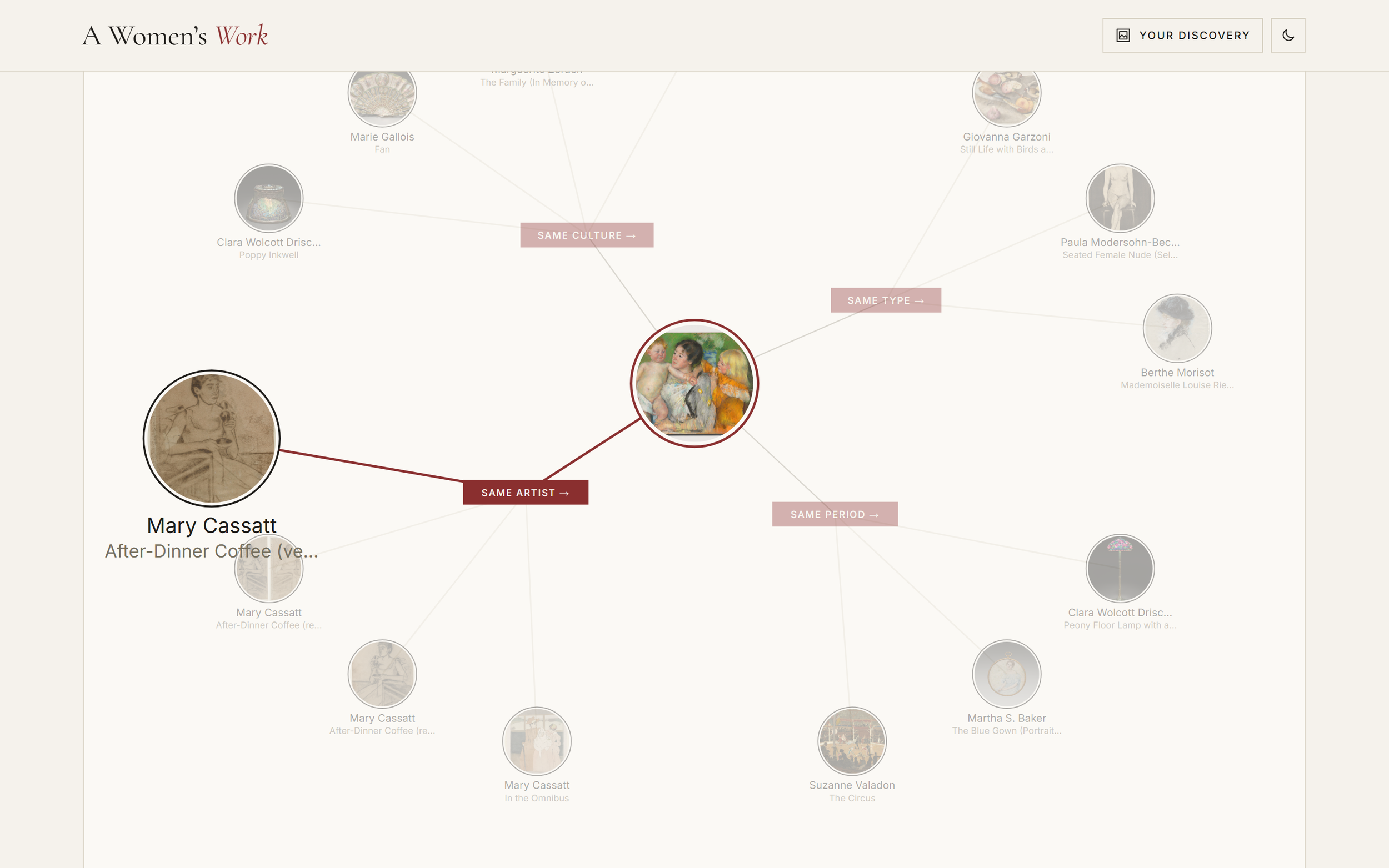
Refined the experience: a sticky header that shrinks on scroll, light and dark themes, hover animation on the connections map, and a faster Unseen page (from about 21,000 page elements on load to 120).
Solution
The answer was to make the gap part of the story: show what can be seen, and count everything that can’t.
Several ways in.
Random artwork, for visitors who simply want to explore.
Look for the artist: four named periods, from Baroque to Neoclassicism to Postwar & Contemporary, plus culture menus with live counts.
Search that explains itself: each result names the field that matched and highlights the word. The API doesn’t provide this, so the site works it out from each result.
Browse artwork or Browse artist: the same results seen as works, or as the women who made them.
The Unseen. The 4,724 works by 942 artists that can’t be pictured get their own page. It explains why copyright keeps them out of view, then lists every work with its details and its maker, by time period, medium and artist, searchable by location. The site’s biggest limitation became its clearest statement.
Connections. Every artwork links to related works by the same artist, culture, type and period. Hovering a work brings it forward and fades the rest, and each connection opens a curated gallery, so one work leads naturally to the next.
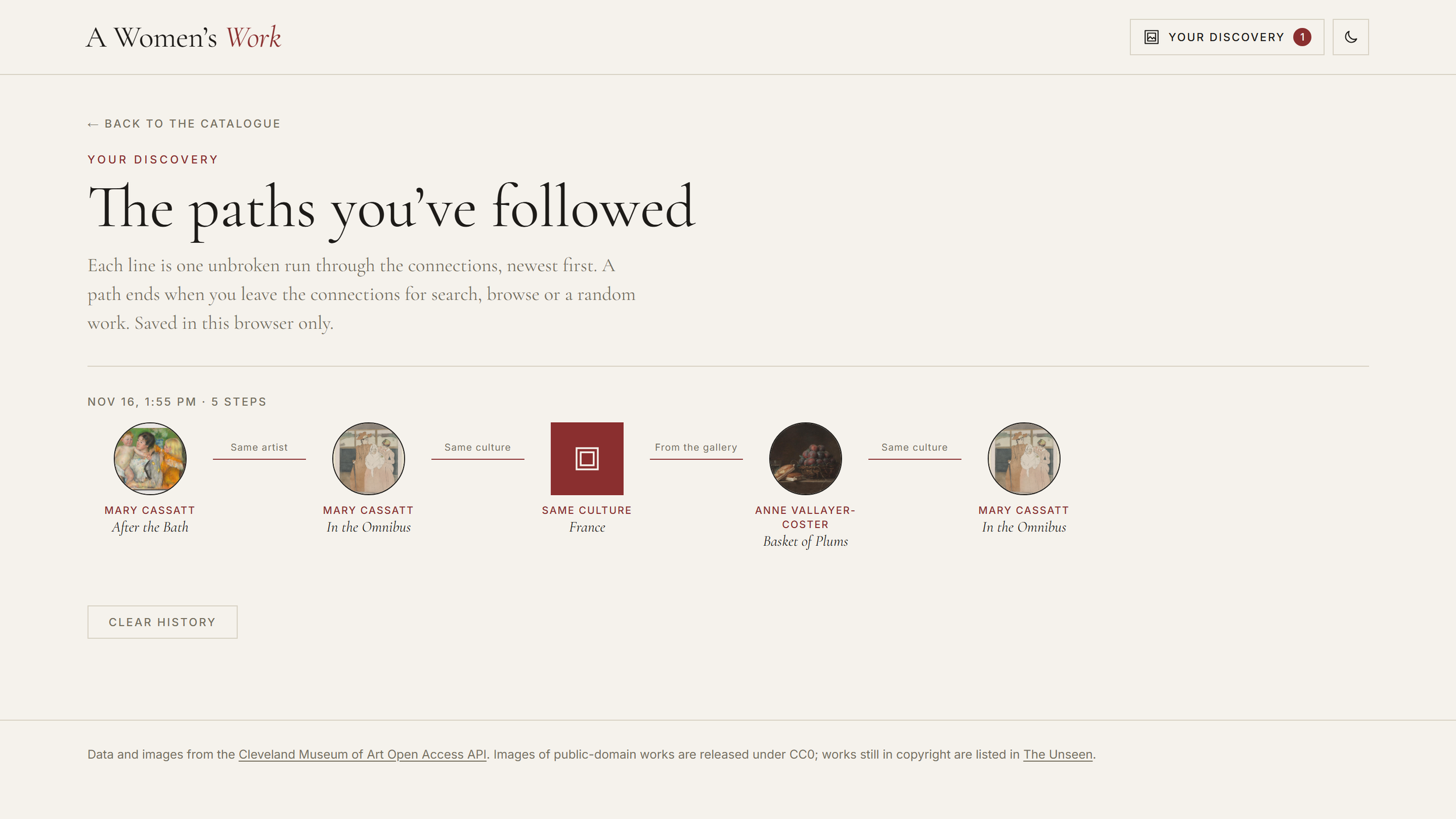
Your discovery. The site records each unbroken path a visitor follows through the connections and draws it as a timeline. It needs no sign-up and keeps no personal data: everything stays in the visitor’s own browser.
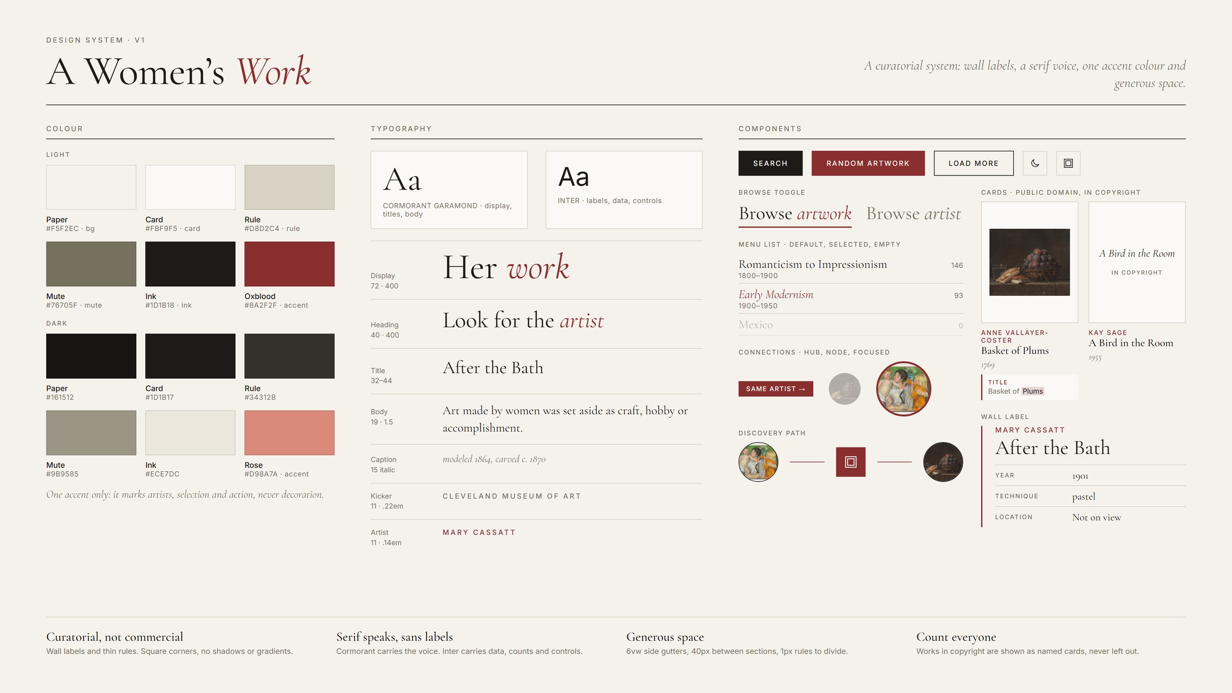
A curatorial design. Wall-label layouts, a serif typeface, one accent colour and generous spacing give every page the feel of a museum rather than a dashboard, in light and dark themes and on phones.
The finished site gives all of the roughly 5,000 works by women in the collection a place: 271 shown with images, and the other 4,724 listed in The Unseen with their makers. It runs as a single static page with no server or accounts, and works on desktop and phone in light and dark themes.
What I learned. Test the data before designing for it: the gap I found in the first hour shaped the whole project. And a limitation can carry the message better than a workaround: hiding the missing images would have repeated the erasure, while naming it makes the point.